CSS Grid Layouts
20 December 2019
The best way to implement a web application with a responsive design in modern browsers where layouts must change between different screen sizes is the combination of CSS Grid and media queries. This powerful combination is pure CSS that allows the developer to rearrange components with ease using a simple, declarative syntax.
This can be seen in this slightly trivialized but simple example.
body {
    display: grid;
    grid-template-areas:
        "nav"
        "main";
}

nav {
    grid-area: nav;
}

main {
    grid-area: main;
}

@media (min-width: 600px) {
    body {
        grid-template-areas:
        "nav main";

        grid-template-columns: 20% 80%;
    }
}
As seen above in the CSS from the example, this truly is a very easy way to rearrange the layout for different device sizes. This is a mobile first design so in a mobile phone screen width device the nav in the form of a navbar will be on top with the menu hidden and the main content below it. For screen sizes that are not mobile, greater than 600 px in this case, the nav will be a side nav on the left taking up 20% of the screen with the main content on the right taking up 80% of the screen.
Going the opposite direction, being a desktop first website, and having to scale down to mobile one can remove sections as shown in this example.
.item-a {
    grid-area: header;
    background-color: lightblue;
}
.item-b {
    grid-area: main;
    background-color: lightcoral;
}
.item-c {
    grid-area: sidebar;
    background-color: lightgoldenrodyellow;
}
.item-d {
    grid-area: footer;
    background-color: lightgreen;
}

body {
    display: grid;
    grid-template-columns: 25vw 25vw 25vw 25vw;
    grid-template-rows: auto;
    grid-template-areas:
        "header header header header"
        "main main . sidebar"
        "footer footer footer footer";
}

@media (max-width: 600px) {
    body {
        grid-template-areas:
        "header"
        "main"
        "footer";

        grid-template-columns: 100vw;
    }
}
One thing that you’ll notice is how descriptive of the final product the grid-template-areas syntax is, what you see in your CSS is what you see rendered on the page which removes a lot of the guesswork normally involved in CSS. Also, notice how simple it was to completely rearrange the layout to fit the mobile form factor. All that I did was redefine the template areas to remove the white space and the sidebar and the page renders just like that.
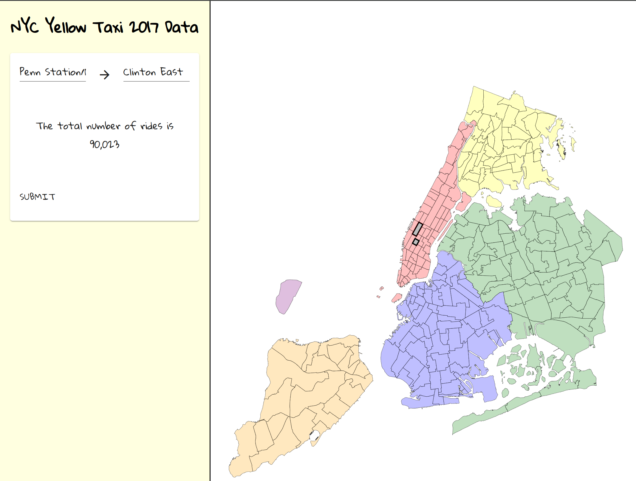
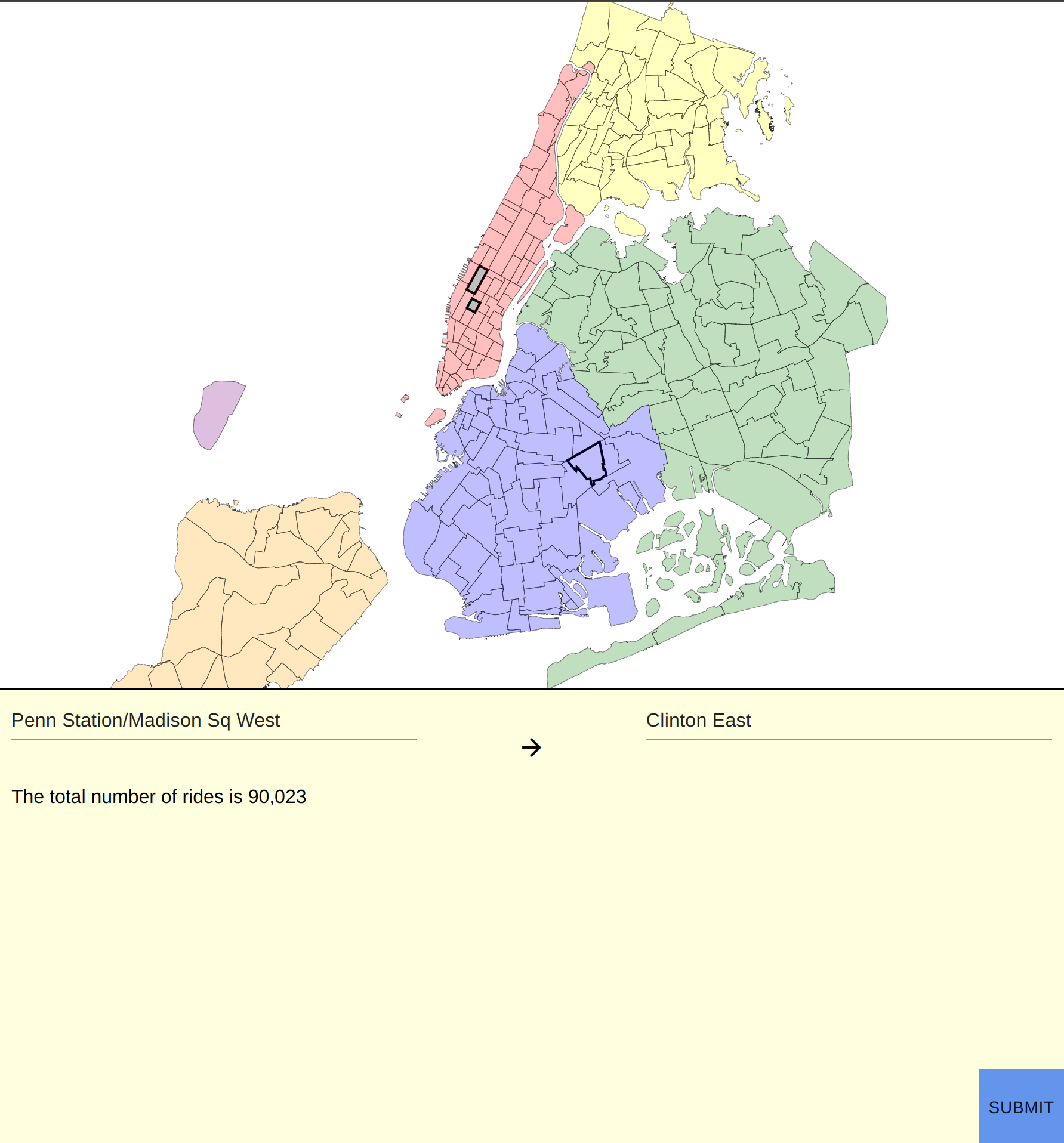
And now onto the question I’m sure a lot of people reading this are wondering: how does this work with javascript frameworks such as React, Angular and Vue? I am delighted to say, quite easily. You really don’t have to change a thing except adding the CSS rules including the media query. You can even complement this technique with the window.matchMedia API to change components to render differently depending on the form factor in addition to changing the layout. An example of this using React is my NYC Taxi project.
class ZoneCardContainer extends React.Component {
    state = {
        loading: false,
        error: false,
        message: null,
        validationError: false,
        mq: window.matchMedia('(max-width: 1024px)'),
        isMobile: window.matchMedia('(max-width: 1024px)').matches
    };

    constructor(props) {
        super(props);
        this.state.mq.addListener(e => {
            this.setState({isMobile: e.matches});
        });
    }

    render() {
        return <ZoneCardView {...this.props} {...this.state} submit={this.submit} isMobile={this.state.isMobile} />;
    }
}

class ZoneCardView extends React.Component {

    return (
            <div>
                {
                    this.props.isMobile
                    ? <div>
                        <div className="mobile-submit">
                            <SubmitButton onClick={this.props.submit}  />
                        </div>

                        {dropDowns}
                        {message}
                    </div>
                    : <Card style={styles}>
                        <CardContent style={contentStyles}>
                            {dropDowns}
                        </CardContent>
                        <CardContent>
                            {message}
                        </CardContent>
                        <CardActions>
                            <SubmitButton onClick={this.props.submit}/>
                        </CardActions>
                    </Card>
                }
            </div>
        );
}
In the above example from the NYC taxi project I have two different views for the ZoneCard depending on the screen size. I set the isMobile state and the event listener to change it on whether the media query matches or not in the ZoneCardContainer. I pass the isMobile state into the ZoneCardView class as a prop and depending on that prop I display one of two cards. This is in addition to the layout changing due to the same media query existing in the App.css file that changes the grid layout.


Some of you may be thinking there are better ways of doing this such as just having a separate mobile site or using a JS library such as Bootstrap to scale between form factors. I have a couple thoughts on this.
In some cases having a separate mobile site may be the way to go but I feel in most cases it is overkill. Really the only time, that a separate mobile site is a prudent choice is when the layout, color ways and even functionality is different on the mobile site where trying to fit that into media queries and changing components would be too complex. This is not the case for most sites though. Usually, one is just changing the layout which we have seen can be handled quite simply using the union of CSS Grid and media queries.
Using Bootstrap, I feel, is a kop out most of the time from doing a tiny bit of work. In lieu of the tiny bit of work, you get ~20kb of fluff, most of which you don’t use, to slow down your page loading. Don’t worry though it’s okay to be lazy sometimes, I still use these libraries to make things look pretty too. However, one thing that most of them don’t do is provide a way to rearrange the layout of pages as seen above.
Using both CSS Grid and media queries as a technique to change layouts between different device sizes is the best way to do so because of its ease of use, simplistic syntax and being pure CSS. I hope you enjoyed learning about this wonderful technique and will use it in your future and current projects. Thanks for reading and if you have any questions or concerns regarding this post please create on issue on Github. As always, happy hacking!
CSS Grid Layouts
20 December 2019
The best way to implement a web application with a responsive design in modern browsers where layouts must change between different screen sizes is the combination of CSS Grid and media queries. This powerful combination is pure CSS that allows the developer to rearrange components with ease using a simple, declarative syntax.
This can be seen in this slightly trivialized but simple example.
body {
    display: grid;
    grid-template-areas:
        "nav"
        "main";
}

nav {
    grid-area: nav;
}

main {
    grid-area: main;
}

@media (min-width: 600px) {
    body {
        grid-template-areas:
        "nav main";

        grid-template-columns: 20% 80%;
    }
}
As seen above in the CSS from the example, this truly is a very easy way to rearrange the layout for different device sizes. This is a mobile first design so in a mobile phone screen width device the nav in the form of a navbar will be on top with the menu hidden and the main content below it. For screen sizes that are not mobile, greater than 600 px in this case, the nav will be a side nav on the left taking up 20% of the screen with the main content on the right taking up 80% of the screen.
Going the opposite direction, being a desktop first website, and having to scale down to mobile one can remove sections as shown in this example.
.item-a {
    grid-area: header;
    background-color: lightblue;
}
.item-b {
    grid-area: main;
    background-color: lightcoral;
}
.item-c {
    grid-area: sidebar;
    background-color: lightgoldenrodyellow;
}
.item-d {
    grid-area: footer;
    background-color: lightgreen;
}

body {
    display: grid;
    grid-template-columns: 25vw 25vw 25vw 25vw;
    grid-template-rows: auto;
    grid-template-areas:
        "header header header header"
        "main main . sidebar"
        "footer footer footer footer";
}

@media (max-width: 600px) {
    body {
        grid-template-areas:
        "header"
        "main"
        "footer";

        grid-template-columns: 100vw;
    }
}
One thing that you’ll notice is how descriptive of the final product the grid-template-areas syntax is, what you see in your CSS is what you see rendered on the page which removes a lot of the guesswork normally involved in CSS. Also, notice how simple it was to completely rearrange the layout to fit the mobile form factor. All that I did was redefine the template areas to remove the white space and the sidebar and the page renders just like that.
And now onto the question I’m sure a lot of people reading this are wondering: how does this work with javascript frameworks such as React, Angular and Vue? I am delighted to say, quite easily. You really don’t have to change a thing except adding the CSS rules including the media query. You can even complement this technique with the window.matchMedia API to change components to render differently depending on the form factor in addition to changing the layout. An example of this using React is my NYC Taxi project.
class ZoneCardContainer extends React.Component {
    state = {
        loading: false,
        error: false,
        message: null,
        validationError: false,
        mq: window.matchMedia('(max-width: 1024px)'),
        isMobile: window.matchMedia('(max-width: 1024px)').matches
    };

    constructor(props) {
        super(props);
        this.state.mq.addListener(e => {
            this.setState({isMobile: e.matches});
        });
    }

    render() {
        return <ZoneCardView {...this.props} {...this.state} submit={this.submit} isMobile={this.state.isMobile} />;
    }
}

class ZoneCardView extends React.Component {

    return (
            <div>
                {
                    this.props.isMobile
                    ? <div>
                        <div className="mobile-submit">
                            <SubmitButton onClick={this.props.submit}  />
                        </div>

                        {dropDowns}
                        {message}
                    </div>
                    : <Card style={styles}>
                        <CardContent style={contentStyles}>
                            {dropDowns}
                        </CardContent>
                        <CardContent>
                            {message}
                        </CardContent>
                        <CardActions>
                            <SubmitButton onClick={this.props.submit}/>
                        </CardActions>
                    </Card>
                }
            </div>
        );
}
In the above example from the NYC taxi project I have two different views for the ZoneCard depending on the screen size. I set the isMobile state and the event listener to change it on whether the media query matches or not in the ZoneCardContainer. I pass the isMobile state into the ZoneCardView class as a prop and depending on that prop I display one of two cards. This is in addition to the layout changing due to the same media query existing in the App.css file that changes the grid layout.


Some of you may be thinking there are better ways of doing this such as just having a separate mobile site or using a JS library such as Bootstrap to scale between form factors. I have a couple thoughts on this.
In some cases having a separate mobile site may be the way to go but I feel in most cases it is overkill. Really the only time, that a separate mobile site is a prudent choice is when the layout, color ways and even functionality is different on the mobile site where trying to fit that into media queries and changing components would be too complex. This is not the case for most sites though. Usually, one is just changing the layout which we have seen can be handled quite simply using the union of CSS Grid and media queries.
Using Bootstrap, I feel, is a kop out most of the time from doing a tiny bit of work. In lieu of the tiny bit of work, you get ~20kb of fluff, most of which you don’t use, to slow down your page loading. Don’t worry though it’s okay to be lazy sometimes, I still use these libraries to make things look pretty too. However, one thing that most of them don’t do is provide a way to rearrange the layout of pages as seen above.
Using both CSS Grid and media queries as a technique to change layouts between different device sizes is the best way to do so because of its ease of use, simplistic syntax and being pure CSS. I hope you enjoyed learning about this wonderful technique and will use it in your future and current projects. Thanks for reading and if you have any questions or concerns regarding this post please create on issue on Github. As always, happy hacking!
